Come, come, and sit you down; you shall not budge.
You go not till I set you up a glass
Where you may see the inmost part of you.
–Hamlet, Act 3, Scene 4
There comes a time in every man’s life when new evidence forces him to reconsider everything he once uncritically believed. For me, that time came when I learned that Secretary of State Marco Rubio and I both like the same font.
According to a New York Times article by Michael Crowley and Hamed Aleaziz, titled “At State Dept., a Typeface Falls Victim in the War Against Woke,” Rubio has called for the reversal of the use of Calibri in State Department documents, saying it “was not among the [Biden] department’s most illegal, immoral, radical or wasteful instances of D.E.I.A.”
I don’t know when that final “A” got added to the list of forbidden initials. (Wouldn’t it already be included in the “I”?) And I don’t know why accessibility would be deemed “immoral” and “radical” by an administration that fancies itself as being Populist. Is it the same reason why, to use another example, the White House decided to stop using ASL interpreters during press briefings, claiming that they “severely intrude on the President’s prerogative to control the image he presents to the public”?
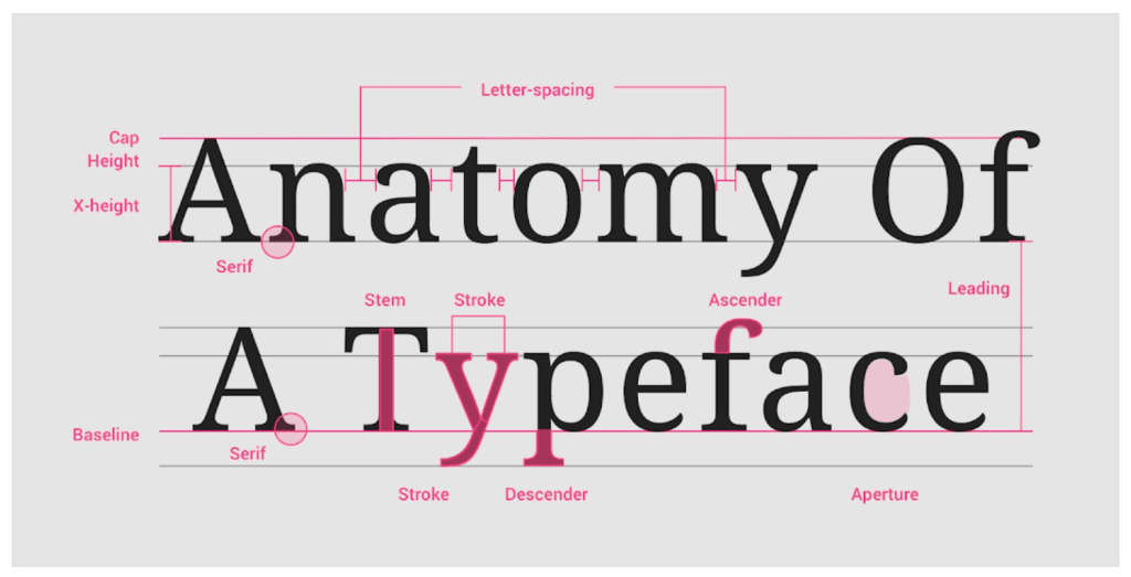
The fact that the font change was a Biden-era policy made it ripe for attack, but Rubio’s ostensible argument is that serifed fonts are more dignified and traditional—that they will “restore decorum and professionalism to the department’s written work,” that they are “generally perceived to connote tradition, formality and ceremony,” that Calibri “clashes” with the department’s letterhead, and that they “[echo] President Trump’s call for classical style in federal architecture,” as seen in “the origins of serif typefaces in Roman antiquity.”
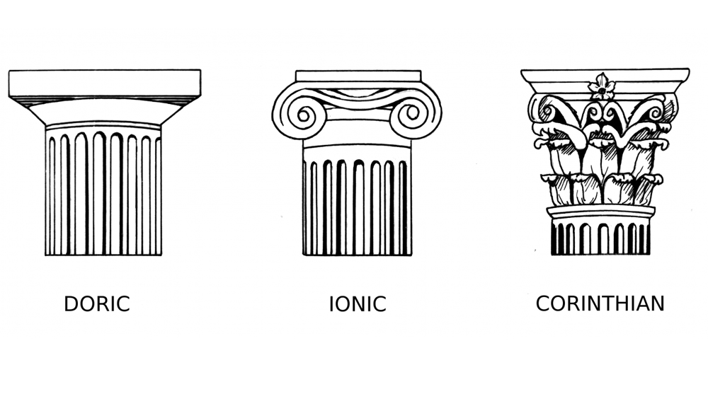
Now, I am no more inclined to believe that the current administration cares about “decorum and professionalism” than I am to believe that Donald Trump values the tenets of classical Federal architecture while he is destroying the symmetry of the White House in favor of an increasingly lopsided addition that more closely aligns—in aesthetics and ideology—with the Imperialism of Vienna’s Schonbrunn Palace than it does with Mount Vernon or Monticello, and while he intends to replace the Ionic columns on the central structure with the more gaudy, serifed Corinthian.
But—and here’s the rub—I kind of get it. I like TNR, too. This post, along with everything I have published, uses it. All the books I have ever read use it. Heck, it even informed the name of this web site, which originated in one of the most frequent comments I found myself using in comments on student papers, the prompts for which generally included the following requirement:
Times New Roman 12 point font, double-spaced, with 1″ margins.
Why? The answer, in a word, is this: print.
It’s the same reason I have directed students to use “standard” sized paragraphs—neither too long nor too short—a design that works out to be around 2.5 paragraphs per page, based on a “page size” of 8.5 x 11. And it’s the same reason I am apt to look upon any book written in a sans-serif font with suspicion—if not outright disdain.
TNR, along with all its concomitant features, is the font of my written and pedagogical life, a habit formed before the internet, which I didn’t even encounter until I was in my 30’s. Unlike Rubio, I’m not hangin’ onto the forms of outdated imperialist dogma; I’ve just been living in my own past. Which, it must be admitted, is also part of my repugnance for AI and my reluctance to incorporate it in my classes.
That must change.
Far from it being “immoral” to start embracing sans-serif fonts in the classroom, I can only conclude, considering internet accessibility issues, that it would be immoral for me not to. So, from now on, I am not going to be a stickler for TNR, and instead allow students wider font access.
But it still must be 12-point. I mean, lets not get carried away.

Leave a comment